One of the core services Nautilus Labs offered was Voyage optimization. A client could use the Nautilus platform to optimize their voyages to improve efficiency and meet their voyage goals.
At Nautilus, we offered Voyage optimization with 3 different goals in mind:
-
TCE Optimization
-
Net Profit Optimization
-
ETA Optimization
TCE Optimization: TCE (Time Charter Equivalent) is a performance metric used in the shipping industry to calculate a vessel’s daily earnings, allowing for comparison across different voyage types.
TCE = (Voyage Revenue – Voyage Expenses) / Voyage Duration (days)
In TCE optimization, using the vessel’s performance model, the necessary data provided by the client (Freight value, fuel cost, time cost, route etc) and the predicted weather (wind, wave and current to identify the ideal shaft speed the vessel need to maintain that would maximize the vessel’s overall TCE throughout the voyage, and recommend that to the vessel captain on a daily basis via email.
Net profit Optimization: Net Profit is the remaining earnings after subtracting all voyage-related expenses from total revenue. These expenses can include fuel, port fees, crew wages, and insurance.
Net Profit = Voyage Revenue – Voyage Expenses
Similar to TCE optimization, in Net Profit optimization, the performance model and other data are used to identify the shaft speed to maximize net profit, and are recommended to the vessel captain.
ETA Optimization: ETA (Estimated Time of Arrival) is the expected arrival time of a vessel at a specific waypoint, port, or destination. ETA is critical for voyage planning, logistics, and port coordination.
In ETA optimization, using a vessel performance model, route, target ETA, and weather forecast, the ideal shaft speed to meet the ETA while minimizing fuel consumption was recommended.
This would be how the voyage optimization process was done -
- Nautilus Data Platform integration team would integrate the vessel’s data from the data source that the client provides, preferably high-frequency sensor data (or noon report data if no available source for HFD) into our platform. The data, including the vessel’s shaft speed, main and auxiliary engine fuel consumption, speed over ground, coordinates, etc.
- The data science team would utilize the data (primarily vessel’s speed and consumption data) and weather data provided by 3rd party providers to build vessel performance models, and then integrate those models into the platform.
- Before a voyage starts, Analysts from the managed services team would collect the route of the voyage, the vessel’s target ETA, and the P&L document (where applicable) and integrate those into the platform. The platform would use those data and the vessel’s performance model to generate the optimal shaft speed the vessel needs to maintain in order to meet the vessel’s optimization goal (maximizing TCE, or minimizing cost, or meeting the target ETA while minimizing fuel cost.
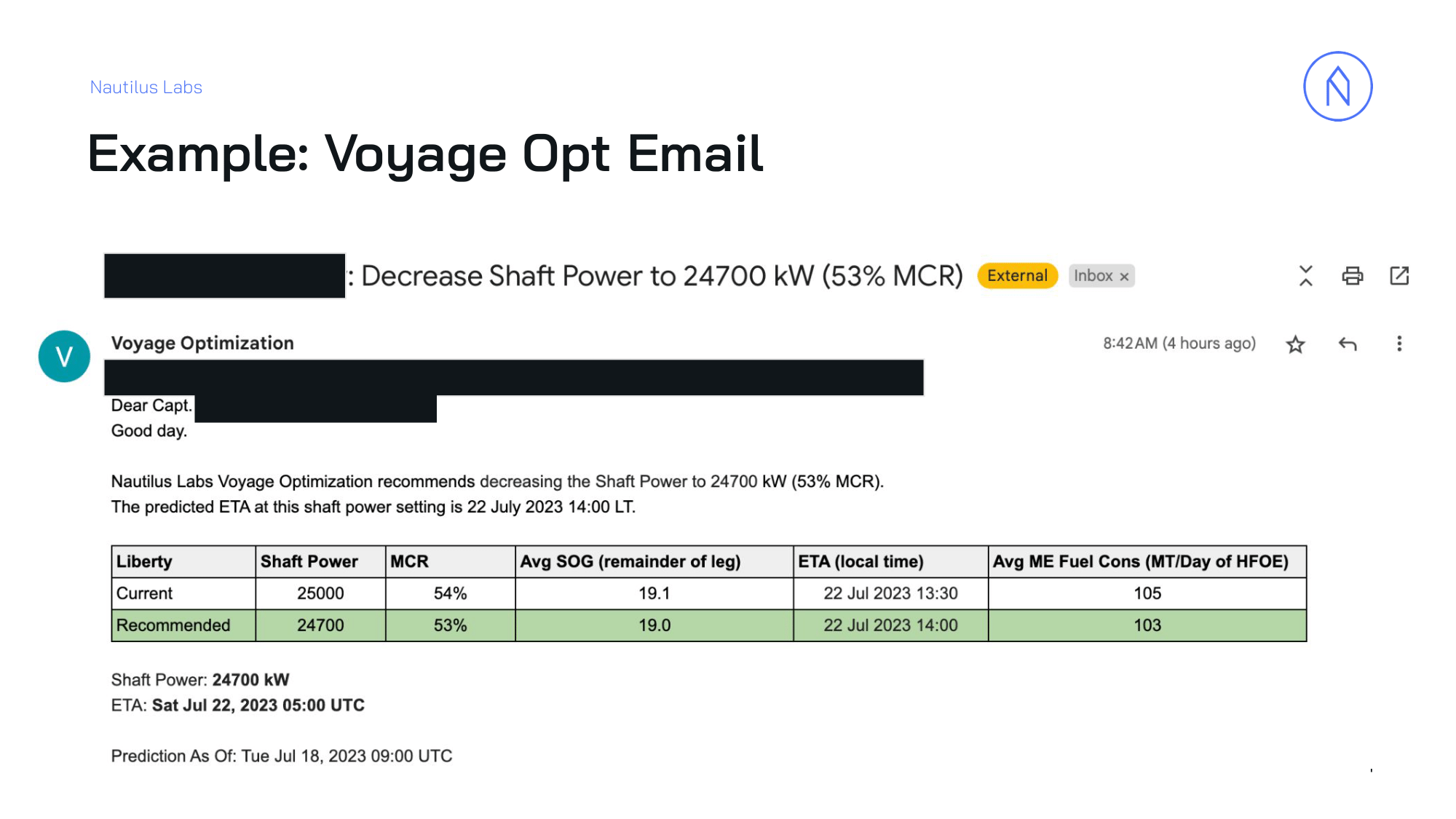
Originally, the platform was intended to be used by the client directly. But the platform was still in the developing stage, and most clients found it difficult to use to achieve their goals. For that reason, the managed services team was developed, and the analysts from the team would use the platform on behalf of the client and send them the most important information.
When I joined the company as an analyst, we only shared the recommended shaft speeds and a few predicted metrics (predicted speed over ground, main engine fuel consumption, predicted ETA, etc) in a tabular format via email. No additional data or visualization was shared.
The platform offered so much more in terms of showing data and visualization, but that couldn’t be utilized.
Also, the limited data and lack of visualization caused a lot of issues. The clients often would have questions about the legitimacy of our recommendation, as they couldn’t see the full picture, wanted to see more than just the predicted shaft speed, wanted to see the predicted metrics in other shaft speeds, the weather forecast, etc.
We were trying to meet those requests by taking screenshots of different visualizations from the platform, running simulations multiple times in the platform, then copying each predicted metric one by one into a spreadsheet, and then adding them to the email, etc. There was a lot of work, and it was time-consuming. When working on it, I immediately saw how there was room for improvement and increasing efficiency. So based on my own experience and talking with other analysts, I identified what
clients want. They want -
-
To see predicted metrics for multiple shaft speeds, not only the recommended shaft speed.
-
Different clients want to see different predicted metrics, not only the ones we typically share (speed over ground, fuel consumption, ETA, etc.).
-
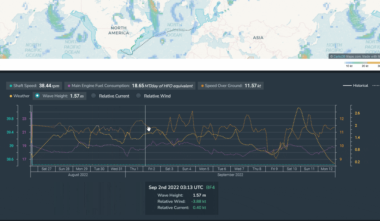
Clients want to see the weather forecasts (wind, wave, and current) and how the weather affects the vessel’s speed and consumption.
-
Some clients want to see the vessel’s predicted positions in a given interval, not only the ETA at the arrival port.
-
Some Clients want to see how often we send them recommendations, and how often the captain adheres to our recommendations.
Taking all that into consideration, I decided to make a tool that would automatically run the models, pull relevant data (historical and predicted) from various api’s, clean, merge them, generate the desired data table and visualizations, and generate and download a PDF report that would contain all those data tables and visualizations. This would save so much time, make our VO process easier, less the room for error, as there is practically no manual work, and make the service look standard and better.
Design:
For designing the PDF, I figured out which piece of data/visualization the client prefers to see, and added it to the PDF. The PDF looked slightly different from client to client based on their requests, but here’s what they mostly look like:
Page 1:
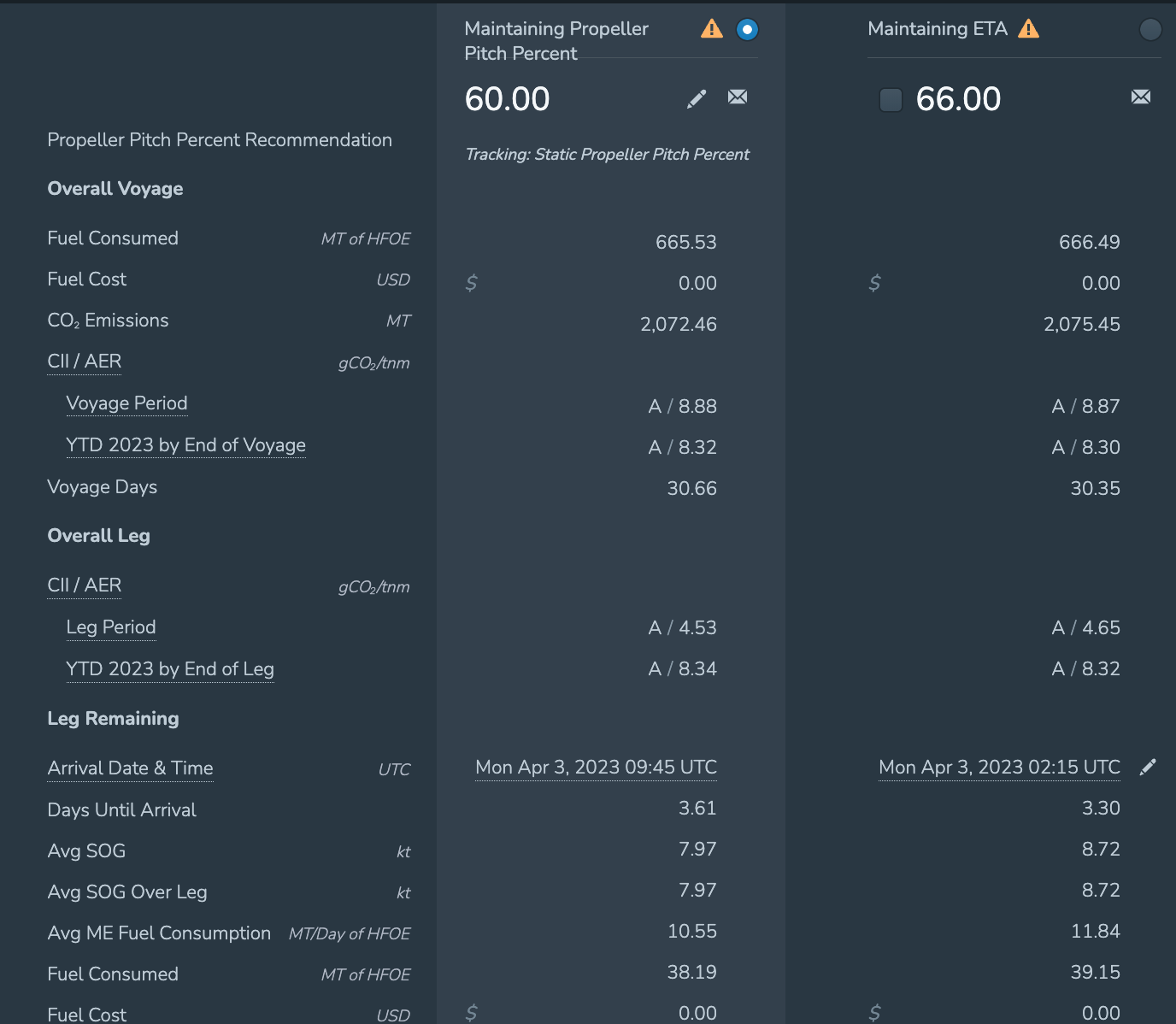
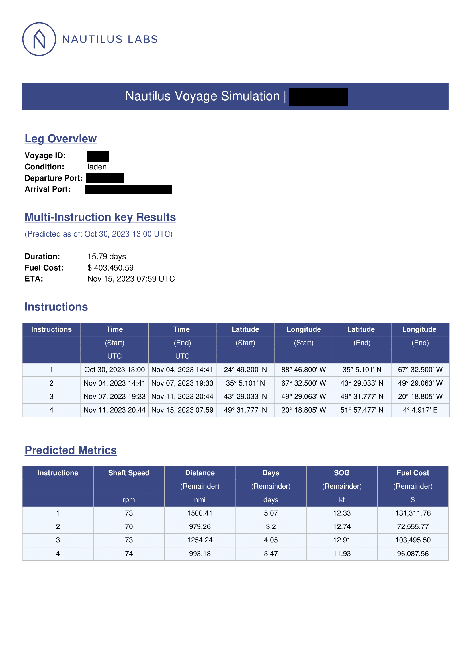
Page 1 included some of the vessel’s metadata - Vessel’s name, voyage ID, condition (ballast or laden), departure and arrival port, etc. It also contains one or multiple predicted metrics tables, containing the predicted metrics (predicted speed over ground, fuel consumption, fuel cost, estimated time of arrival, etc.) for various shaft speeds
Page 2:
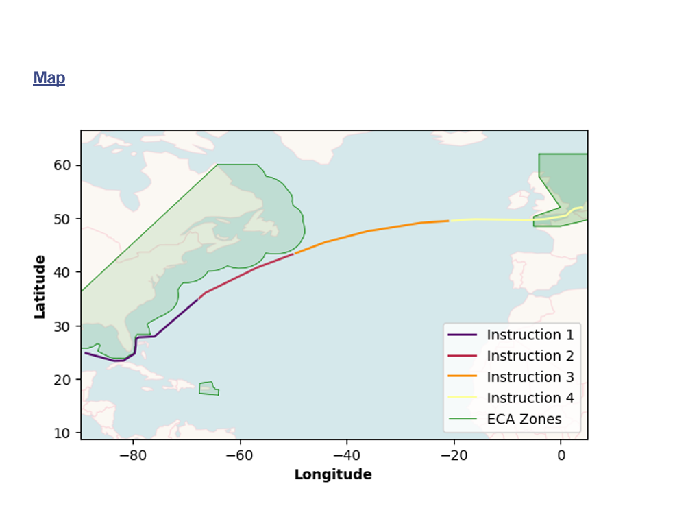
Page 2 includes a map, containing the vessel’s current position and the route the vessel took for the voyage (for live VO) and the rest of the route remaining for the voyage.
For multi-instruction VO, the remainder of the route is separated and color-coded to express different segments of the voyage.
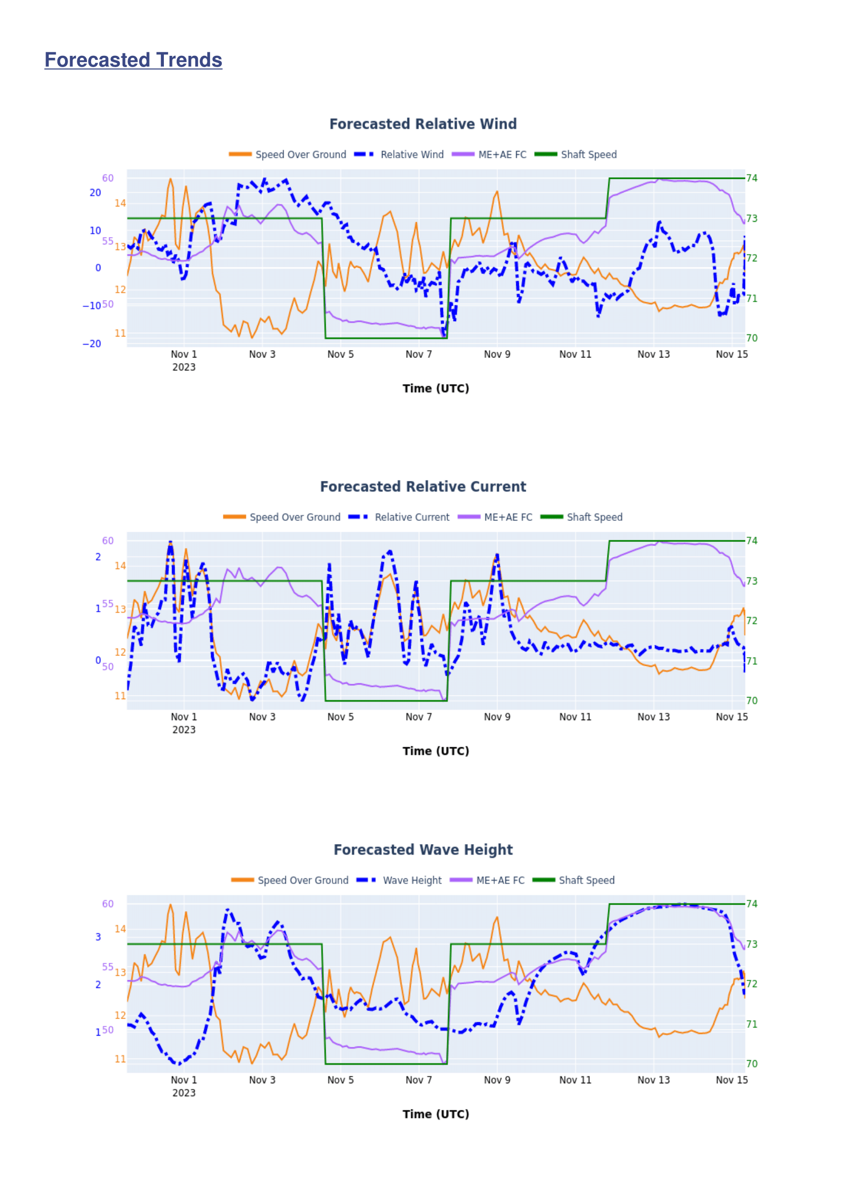
Page 3:
Page 3 contains weather graphs, visualizing how different weather metrics (relative winds, relative currents, and wave heights) affect speed over ground and fuel consumption.
Final Thoughts
This voyage optimization report started as a response to a very practical problem: we had powerful models and a capable platform, but the insights weren’t reaching clients in a way that was clear, trustworthy, or easy to act on. What began as an effort to reduce manual work and answer recurring client questions quickly grew into a standardized reporting tool that reshaped how we delivered voyage optimization at Nautilus.
By automating the full pipeline—from running the models and pulling data from multiple sources to generating visualizations and producing a client-ready PDF—the tool significantly reduced turnaround time and eliminated a large source of manual error. More importantly, it changed the conversation with clients. Instead of questioning a single recommended shaft speed, they could see the broader context: trade-offs across speeds, the impact of weather, projected positions, and how each recommendation aligned with their specific goals, whether that was TCE, net profit, or ETA.
For me, this project reinforced the importance of transparency and design in data-driven products. Accurate models alone aren’t enough—how insights are communicated matters just as much as the math behind them. By focusing on what users actually wanted to see and tailoring the output to their needs, the service became easier to trust, easier to scale, and far more effective.
This was also a turning point in how I approached problem-solving. Rather than working around limitations with manual processes, I learned to step back, understand the real pain points, and build tools that addressed them end to end. Many of the ideas and principles from this project carried forward into other tools I built later, both internal and client-facing.
Voyage optimization is a complex and often opaque space, blending performance modeling, economics, and weather uncertainty. My goal with this report was to make that complexity visible and understandable, without oversimplifying it. If anything in this post sparks questions or curiosity—about the modeling, the design choices, or the operational realities behind it—I’d be happy to dive deeper. Until then, fair winds and following seas!